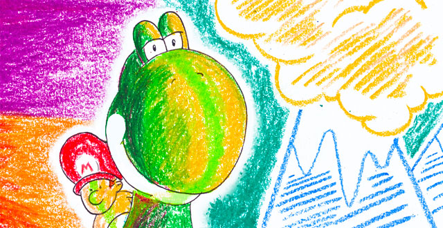
In Kill Screen, Kyle Chakra finds the plumb line from Fauvism and Yoshi’s Island:
Fauvist pictures burn into your retinas. Derain’s The Turning Road at L'Estaque (1906) is a dusky mix of reds and oranges, but the shadows of the trees set into the road cast deep-blue shadows, tinged with green. It’s the light of an intense sunrise or sunset.
The favored technique to create this burn was to set two complementary colors against each other. The classic combination is red-orange on blue (clearly apparent in The Turning Road referenced above), but any opposites on the color wheel—pink and green, yellow and purple—all pack the same punch. Derain’s same technique is clear in Yoshi’s Island: check out Level 1-1 and see the yellow hillsides dotted with cool-blue rock outcroppings, jutting out into a pale-blue sky and clouds tinged subtly with orange and pink. The trees of 6-1 are bright orange-red, but their shadows, silhouetted in the sunset, are deep blue. In 3-2, yellow leaves stick out against a dusky purple background. The palette is strikingly similar to that of The Turning Road.
It’s not just the game’s colors that recall Fauvism. Yoshi’s Island’s aesthetic is painterly, displaying individual brushstrokes. Neither the paintings nor the game display a need for gloss or perfection; they’re messy, embracing a loose sense of serendipity, colored collisions. Shigeru Miyamoto, the iconic Nintendo designer who has noted the influence from Impressionism on his games, pushed Yoshi’s Island to look hand-drawn, emphasizing the scratchy crayon strokes that make up the game’s backgrounds and the rough outlines around its sprites.
Gamers don’t need to just take my word for it that Yoshi’s Island was influenced by Fauvism and its contemporaries. Just ask Miyamoto: in the upper reaches of Level 6-7 there is an outright nod to Vincent Van Gogh with a sky full of hazy moons and stars, shown in brushy yellow strokes against a deep blue.
 In Kill Screen, Kyle Chakra finds the plumb line from Fauvism and Yoshi’s Island: