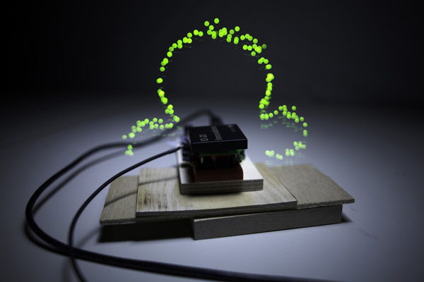
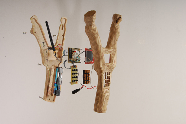
SMSlingshot, Christian Zöllner, Patrick Tobias Fischer, Thilo Hoffmann, and Sebastian Piatza of VR/Urban (2009) - Photo by VR/Urban
Talk to Me: Design and Communication between People and Objects is an ambitious exhibition at MoMA curated by Senior Curator in the Department of Architecture and Design, Paola Antonelli. Focused on new modes of communication and interactivity, the exhibition captures over 194 works from an international group of aritsts and designers. The space is divided into five themes and includes work ranging from Jason Rohrer's minimalist game Passage (2008) to Sputniko!'s role-reversing Menstruation Machine-Takashki's Take (2010). After touring Talk to Me on a rainy weekday with Paola, we met in her office to discuss the importance of collaboration, QR tags, and speculate about the future.
Jason Huff: You have curated numerous shows on the frontier of design and its intersection with technology among other fields. Design and the Elastic Mind, from 2008, stands out because of it’s timing within the latest rush of social technology and interaction that has arguably become the norm over the past few years. What makes Talk to Me distinct in this lineage of exhibitions?
Paola Antonelli: In Design and the Elastic Mind, the communication between people was
just one of the facets as it was about design and science in general.
Therefore, there was a really big presence of synthetic biology, for instance,
or nanotechnology, nanophysics, robotics. There were a lot of different topics
involved. Thinking back, pieces
like Google Earth, Google Moon and Google Mars from Design and the Elastic Mind would have fit in [Talk to Me]. So
could have the One Laptop per Child project.
But it really was about designers
working with scientists and scientists working with designers. At that time,
the conclusion was that designers and scientists worked very well together
because they both had ambitions to occupy a different position in society and
in culture. Designers want to be taken more seriously; they are tired of being
considered “prettifiers” that go straight to the House and Home section of the New York Times, and scientists
want to be considered less lofty, less abstract, disengaged, and disinterested
in human beings.
In Design
and the Elastic Mind I
came up with the idea that designers, when they are really good, take
innovations that are considered disruptive and make them non-disruptive.
Designers take revolutions and make them into objects that we can use.
The inspiration for Talk to Me
came from the acknowledgment that things have always had a rapport with us,
even in past centuries — maybe it was affection for an object that was an
heirloom; it was the bridge where you had your first kiss; there was a
relationship, sometimes it was aversion or revulsion, other times, of love.
Very rarely is there indifference. If you think of a chef and his knives for
example. Lately digital technology has made this relationship more explicit and
sometimes verbalized, or just more articulated.
The message of Talk to Me is
that designers today cannot just think of form, function, and meaning. They
also have to think of script. Now, as a designer, you really have to think of
how those objects are going to interact with people. Of course, this comes naturally
to interface and interaction designers, but not as much to product designers or
furniture designers—but they all have to learn that this is what’s necessary
today.

Suwappu, Camille Bozzini of Dentsu London and BERG (2011) - Photo by Dentsu London
Photo credit: Dentsu LondonJH: To follow up on the idea of objects
requiring a type of interaction, I wanted to ask about the title cards from the
show. Each piece has a Twitter hashtag and QR tag, and I was wondering what
inspired that decision? How successful do you think that
has been at generating social connections around the work?
PA: Interestingly, it has been really
successful. Yesterday, I was at MoMA’s Chief Information Officer’s office and
he was showing me a graph with jumps in wi-fi use that are connected to the
opening of the galleries — Talk to Me has really affected those numbers.
QR tags are a necessary evil
right now. We’re not trying to set a new standard with them, because we don’t
find them particularly cool. In two years, we probably will not need them
anymore when GPS signals become more precise and we have better shape
recognition software. But right now they do also appear in the book.
With the QR tag reader, if you
are in bed, you can watch the video connected to an object in the book seamlessly.
The difference between QR tags in the show to those in the book, is that with
the book you are connected directly to the video that is part of the web page
that refers to this particular object in the show, not to the exhibition’s web
page. The experience is really smooth in the book.
In the show, if there are too
many people or you want to remember to revisit that particular object
afterwards, you can just bookmark it by scanning the QR. On the other hand, in
the book, not every object has a QR tag because it’s not necessary, but every
object in the show instead has a QR tag. And every object in the show has a
hashtag because you can tweet about it and have the traffic reflected it on the
website. I am the official Twitter person for this exhibition, so I am the one
tweeting - I just discovered to my dismay that I did not store all of the
tweets from the very beginning so some of them got deleted.
JH: Oh no. I didn’t know you
could lose track of tweets, or that they expired.
PA: Yes, it’s too bad. But it was still
recorded on the website. In fact, Twitter has been used sparingly. It is very
present and we hope that it’s used well.
JH: Thinking more about the social and
political space that the show engages - from the Gentrification Battlefield,
which is a humorous and interesting concept, all the way to the notepad by
SWAMP who are now starting to use information leaked from Wikileaks in their
work. What do you think is the value of a designer’s approach to the political?
PA: Truly, as I have a European
background, to me, politics is everything because it’s about life together,
beyond the smallest nucleus of the family. But in the exhibition, there are
some genuinely political pieces - and
not only pieces like those by SWAMP that show civilian deaths in Iraq, and which
I think tackles an extremely important subject.
In my opinion, one of the most
political pieces in the show is the Menstruation
Machine. I love it because it is about really trying to understand
others. It has no party or no ideology, but it’s about giving men the honor and
opportunity of experiencing what it means to have a menstrual period. Excuse me
— it’s such a big idea, it’s so political and it’s also very progressive. It
really is about putting yourself not in somebody else’s shoes, but in
somebody’s sanitary pads, in other words — it’s very powerful. It’s a little
personal, too.
There are a lot of politics
involved: some overt and readable, and some more subtle. Other openly political
pieces include Josh On’s They Rule,
which is a pillar in the history of interactive websites. Also, there are
pieces that are about active citizens like Ushahidi. And, there are pieces that are about clear and
empathetic information, like BBC Dimensions.
The Homeless City Guide is also in that realm — there are different
scales of politics represented in this show, from the very intimate to the
cosmic.
I would say that of course there are designers that still make furniture and products, and they might not express all their politics into an iPad or an iPod; but still, I consider political every action of making. And how much you can express yourself. As a designer you have to look professional, so sometimes you will have a great commission that enables you to really make your voice heard and other times, you will have to have side jobs that are your own art.

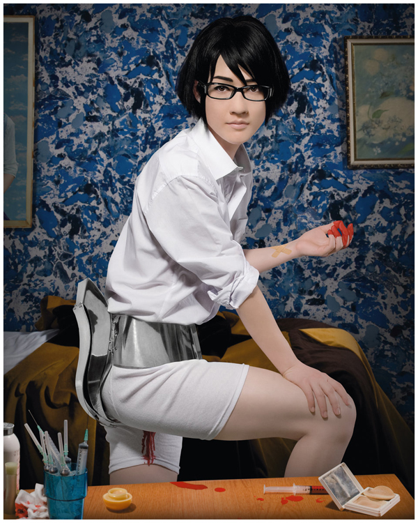
Menstruation Machine–Takashi’s Take, Sputniko! and Design Interactions Department Royal College of Art (2010) - Photo by Rai Royal
JH: Thinking about that and the
different shifts and flows of projects and commissions for designers, I noticed
something interesting in the labels around the show, that there were longer
lists of names, some pieces of singular attribution, and then numerous
collaborative attributions.
The way that institutions were
listed was also a little curious. They were simply listed in the mix of names
instead of being separated and put in a different place on the labels. What was
your thought process behind that layout decision?
Do you think the field is
changing around ideas of collaboration and if so how - how is collaboration and
attribution changing?
PA: First of all, thank you for noticing as
we spent a lot of time in that. We decided that when somebody funded something,
it would go inside the extended label and if a designer had done something when
he was in school, the school would be listed in the design section, in the
attribution part.
There was a lot of thought that went into it and also a lot of listening to the designers themselves, because in some cases, we had long lists of names and in other cases, they just named their firms; we respected their will because I think that sometimes the most collective and collaborative pieces are the ones that only have the firm’s name.
But I don’t
know that the nature of collaboration is changing. I think people just want to
flaunt collaboration more.
Just before you came in to talk,
I saw a designer that I love, Oded Ezer. You might remember him from Design
and the Elastic Mind. He did Typosperma - the sperm with the typography
inside. He told me that he has decided to change the name of his firm from “Oded
Ezer Typography” to “Oded Ezer and” because he has been having so much fun
collaborating with people. He collaborated with Jonathan Safran Foer in a
project and then with Erik Spiekermann in a different one – afterwards, he
decided to call his office “Oded Ezer and”, and to invite people to
collaborate.
I feel that now, more than ever, there is not only so much economic potential, but also potential in collaborating like in all the different cooperative offices that we hear about from Studiomates, for instance, to the building at 55 Flatbush in Brooklyn. There is so much going on that is about working with other people to produce better outcomes. Even if they are not doing the same work, they are on the other side of the room and you see their minds rolling. Thus, I don’t know if collaboration is changing, I just think it’s a great moment for collaborations.

E. Chromi, James King and Alexandra Daisy Ginsberg with iGEM 2009 Team and University of Cambridge (2009) - Photo by: 066 Ösa Johannesson; 067-068 Alexandra Daisy Ginsberg and James King
JH: You have a history of putting
together bold exhibitions. You also helped MoMA acquire the “at” symbol. In
your boldness was there a specific challenge in curating Talk to Me that
presented itself? What was the most challenging aspect of kind of putting the
show together?
PA: The most challenging aspect was that I
was afraid that the space would be too small. So the installation aspect was
the most challenging to me.
Kate Carmody (curatorial
assistant) and Betty Fisher (exhibition architect) did a fabulous job, and we also had a blog in which we showed the curatorial process. At some point, we even
started posting things about the installation because we feared that our 80+
screens might have made the show look like a computer trade show.
We first looked at bus shelters
from Russia — meaning concrete-like mushrooms. Then at minigolf courses. We
were just taking all these different metaphors and at one point it was totally
Betty Fisher’s idea that ended up making the most sense. I was still stuck on
the bus shelters from Russia when Betty just took Talking Carl and said, “You know Paola, you like Talking Carl so
much, let’s take a 30x30 module and make the whole exhibition out of it.”
I was fine with it so long as you
could not see the module. I wanted it to look more like Monument Valley, another
metaphor! She did a fantastic job. Now, I am amazed that even on a rainy
weekday with lines around the block to get into the museum exhibition, it gets
crowded but doesn’t feel suffocating.
And that was the biggest
challenge more than anything else, because even though Kate Carmody and I had
collected a large number of pieces, it was not hard to skim and to strip it
down to the 194 works that are in the show right now.
Actually, you know what the
biggest challenge was? Electronic Arts. We wanted to have Sim City in the exhibition; but we
could not get anybody to sign off on it. They acquired Maxis and Will Wright is
nowhere to be found. We are also thinking about Sim City for the collection, but we don’t know if we will ever
be able to acquire it because we feel like we are talking to a wall.

Immaterials: Ghost in The Field, Timo Arnall (2009) - Photo by Timo Arnall
JH: The show has been up for over two
months now and you’ve had some time to spend with it and get feedback from
colleagues and the community. Reflecting back on the show, do you have an idea
of what you might curate next or what your next move might be?
PA: I have several proposals but they are
not yet on the calendar. There are many things that I am interested in, like
what does organic design mean today, for instance. That’s something that I find
really interesting. I’m also interested in the concept of violence and how it’s
connected to design.
There are many ideas but not
exhibitions yet. But what we are looking into are video games and really, how
to collect video games and what it means to collect video games within a design
collection, and not in a video collection.
Last year, we began a collection
of digital typefaces, which is up right now. I am quite proud of how we were
able to show typefaces. They faced the danger of looking pretty sterile.
Architecture can face the same problem. Sometimes if you show the drawing,
people can misinterpret it - so we are going to augment that.
JH: Outside of curating exhibitions do
you have any thoughts about what might come next for the field of design or
themes that might be trending or passing?
PA: Absolutely. Well, visualization design
has had a gigantic push and big moment. I wonder if now it has to descend a
little bit because the risk when there is so much interest in it, is that there
happens to be a lot of white noise — but overall it’s part of the evolution.
This morning designer
James King, who was also in Design and
the Elastic Mind with Meat of Tomorrow and has a piece called E.chromi together with Daisy Ginsberg
that colors your poo, was here. He told me that he just opened an office in
London called Science Practice. And that he initiated a whole program with the
University of Michigan putting together four different schools. One was the
Risk Assessment School and one of the other ones was the Public Policy School.
They collectively address the problem of synthetic biology and its risks for
the world. He is also working on an arsenic detector, to address the problem
that so much water of the world has arsenic in it. This arsenic detector is a
test that you can apply everywhere that had a half a million pounds of funding
from the Wellcome Trust.
We are talking about real
collaborations between designers and scientists. It’s not only little iGem
projects. It’s real collaboration. This particular realm of design and science
is continuing together with a great moment of critical design.
